Designing my Website
- Sep 20, 2021
- 4 min read
In my last blog post, I mentioned the importance of having a website and the fact that I needed to start on mine. Luckily for me, in one of our classes we have to create a website for our final assessment. Do not get me wrong, I was completely excited to start with it, I know I’m a nerd, but after I started looking for inspiration I started to freak out.
In another of our courses, one the things they are trying to teach us is how to set up our business. This comes very handy for this assessment because they keep telling us to think on our value proposition. This value proposition is tied to our brand and the message we want to convey with our website.
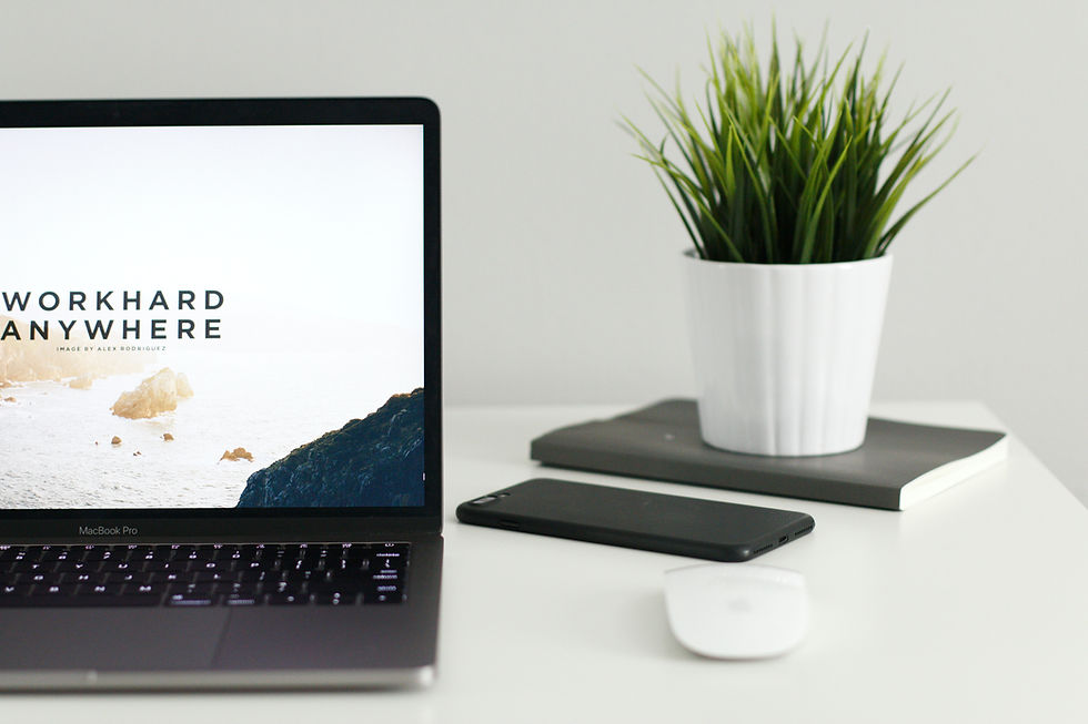
Even though every class starts to come together, it also starts to get more and more scary. Creating a website is not just putting a bunch of images together, such as the collection of images we did for our previous assessment. It also means making the reader understand who we are, what is our brand, what we offer, why we are good at it and what makes us different from the rest.
Looking at different websites, it was easy for me to know what I didn’t like, and I was able to identify why some websites would be more appealing for me than others. Some of the things I identified, and I knew I had to include in my website where:
Responsive design: Nowadays, almost everyone searches for a website on their phone. Therefore, it is mandatory to create a website that changes its look depending on the device used by the reader. A responsive design will allow the website to be readable in a smaller device, without loosing its attributes and its aesthetics.
Helpful navigation: The reader should be able to find where they want to go on the website in seconds. The use of drop-down menus or navigation bars are suitable for this intention. It is also very important to test the links and verify they all work. Having a broken link or a link that takes the reader nowhere, will make the experience frustrating.
Brand identity: Taking into consideration that it is going to be a website for my brand, elements such as the colour scheme, font, types of graphics, images, tone, and message of the brand must be considered. Everything on the website will give the reader a message, it is up to me and my design to send the correct message to the reader.
High quality content: This website is going to be used to tell the world what my skills are, what I’m good at, what am I passionate about, this is the introductory sentence to any possible job I might want to get in the future. The content in it must be clear, readable, valuable, and updated constantly.
Blog: Not every website needs a blog, it depends on the owner of the website and the effort they are going to put into it. I have said before that I enjoy writing and therefore, I believe having a blog is a key component for my website. But a blog is no good if it does not have clear and interesting content and if it’s not updated constantly. Having a blog means researching, reading, coming up with fresh and informative content, content that is related to the website and the brand, content that the reader will like.
Contact information: Include the business’ phone number, address, and email in the footer of the page or as another page on the website. This allows the reader to know who to contact and where they are based in. Also, adding social media buttons helps to connect with potential customers.
White space
Even though the other elements are extremely important, white space was the most important for me. White space is all the area in between the design elements, even the space in between the typography. This space is not necessarily white, it can be any colour, texture, pattern, or background image but it is important to focus on the message white space needs to convey.
White space is used to allow the design to breathe, it is a tool used to balance design elements and to improve the visual communication. Using a texture, pattern or background image as white space can be tricky. These elements can make the general aesthetics to look cluttered, can make the reader loose focus and can make the website feel too chaotic.
This white space or negative space also allows the design of the website to have focal points that direct the readers’ attention. These focal points can be the featured posts or images.

At the end, white space in any website needs to be aligned with the branding. If the website is for an interior design studio that focuses on clean lines, neutral colour schemes, minimalistic style, white space needs to be used to enhance the value of the brand.
Taking into consideration the nature of my website and my brand, these are some of the elements that will guide the general appearance and layout of my website.


Comments